Developing a Family Brand
Every product family has a unique origin and backstory that is shared with each of its family members, expressed through structure, symbolism, language and images. These similarities need to be reflected through the product family’s communication.
Individual Expression – Corporate Design
On the other hand, each family member is unique and requires the freedom to express their own personality. This sense of individuality also needs to be considered in the corporate design of the product family. Both cohesiveness and individuality are expressed through the corporate design concept for Octapharma’s Immunglobuline products.
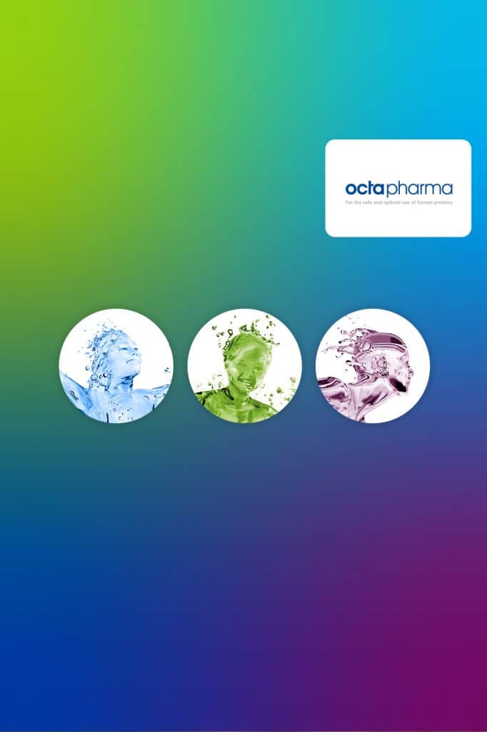
Key Visuals – a strong Expression
Symbolizing purity and compatibility, the dynamic, aquatic human figures act as a key visual for the different products. The concept of woman, man and child – separate yet part of one family – mirrors the unique selling point of each individual product.
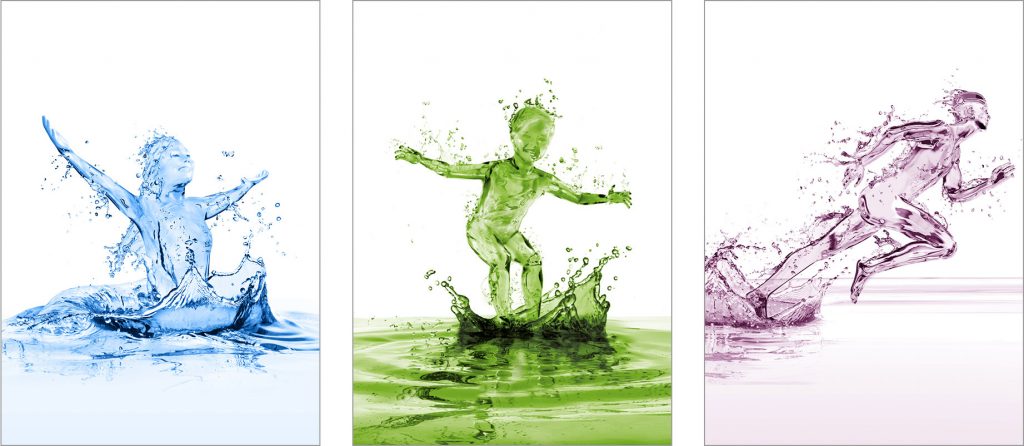
Corporate Colors of the Family Brand
The idea of individuality is further communicated through the use of color and images. octagam®, a classic Immunglobline, signifies purity, compatibility and experience. gammanorm® is characterized by its ease of use, while panzyga® represents a lifestyle product from the future.

More information:
» octapharma.de | Website for Octapharma Germany